
Email marketing is a powerful tool for reaching your target audience and driving conversions. Considering the increasing number of individuals who use mobile devices to check their emails, making sure your campaigns are designed to be compatible with these devices is critical. In this post, we'll explore why it's necessary to create mobile-friendly email marketing campaigns, and we'll provide you with the steps you need to take to make sure your emails are responsive and user-friendly.
Why is it Important to Address Mobile Users?
As more than half of all emails are viewed on mobile devices, it's essential to consider this audience. Mobile users are always on the go, and they expect to be able to view and interact with emails seamlessly on their phones and tablets. If your emails are difficult to read or use on mobile, there's a good chance that users will delete them or, worse, mark them as spam.
Be Sure Not to Leave Out Mobile Users When You Design Your Email Marketing Campaigns
To ensure that you're reaching your entire audience, designing your emails with mobile users in mind is crucial. This means taking into account the smaller screens and limited bandwidth often associated with mobile devices and creating emails that are easy to view and interact with on these devices.
Responsive Emails Can Be an Excellent Way for Brands to Reach Customers on Their Phones and Tablets
Responsive emails adjust their layout and content to automatically fit the device screen they view. This means that regardless of whether your email is viewed on a desktop computer, tablet, or smartphone, it will always look great and be easy to use.
Creating an Adaptive Email Design
If you're starting from scratch, there are a few key elements that you should consider when creating an adaptive email design:
- Use a single-column layout
- Ensure that the font and layout of your text are optimized for viewing on mobile devices
- Use large, tap-friendly buttons for links
- Optimize your images for mobile devices
- Be mindful of your subject line length
How to Create Mobile-Friendly Emails
1. Use a Responsive Email Template
A responsive email template is a pre-designed email layout that automatically adjusts to the screen size of the device it's being viewed on. Using a responsive template takes care of many of the design challenges associated with creating mobile-friendly emails, and it can save you a lot of time and effort.
2. Test Your Emails on Different Devices
Before sending your emails, it's essential to test them on various devices to ensure that they look and work as intended. This entails verifying on multiple devices such as desktop computers, laptops, tablets, and smartphones. You can use an email testing tool to preview your emails on different devices or send test emails to yourself and view them on other devices.
3. Keep Your Design Simple
Simple, clean designs are best for mobile-friendly emails. Avoid using complex designs or layouts, as these can be difficult to view on smaller screens. Stick to a single-column format, and ensure that your text is easily read on smaller screens.
4. Use Large, Tap-Friendly Buttons for Links
Make it easy for mobile users to tap your links by using large, tap-friendly buttons. Make sure that the controls are clearly visible and can be easily pressed even on smaller screens.
5. Streamline Images for Mobile Viewing
Mobile devices may struggle loading images, making optimization crucial. This involves shrinking the size of images through compression and providing descriptive text for those who have disabled image display in their email software.
6. Keep Subject Lines Short and Sweet
Mobile users are often on the go and have limited time to read emails, so it's essential to keep your subject lines short and to the point. Aim for subject lines that are less than 40 characters in length.
7. Use a Single-Column Layout
A single-column layout is the easiest to view on mobile devices. This layout places all your content in a single column, making it easy for users to scroll through your email and find what they're looking for.
Testing and Optimizing Your Emails
Once you've created your mobile-friendly emails, trying them on various devices is essential to ensure they look and work as intended. It would help if you also were tracking the performance of your emails and using this data to optimize and improve your campaigns over time.
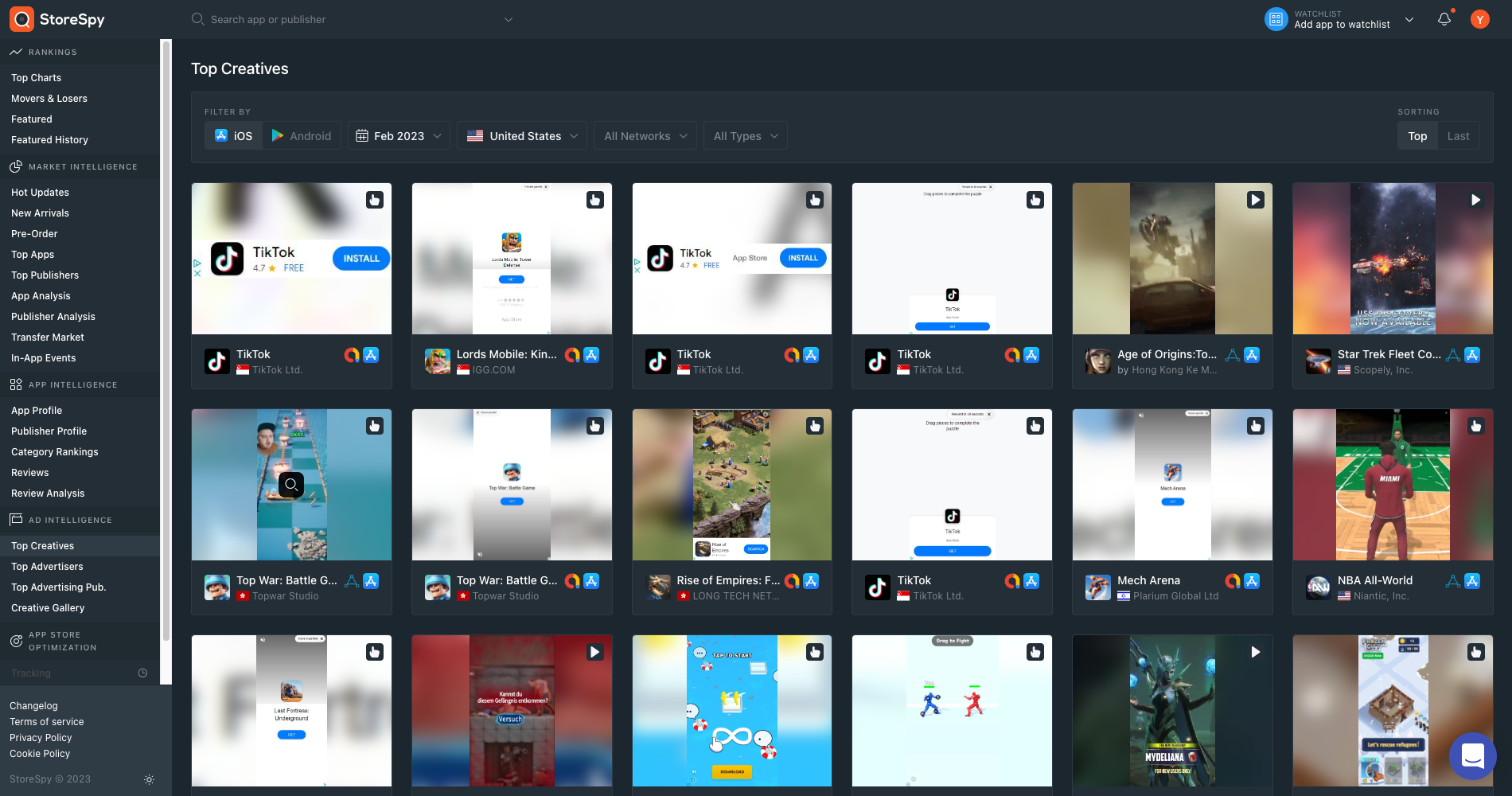
Utilizing StoreSpy
StoreSpy is not just a tool for app optimization and intelligence; it can also be a valuable asset for your email marketing campaigns. Using StoreSpy's Market Intelligence module, you can understand the current trends and growth opportunities in the mobile app market. Using this data, you can create custom email campaigns that address your target audience and their preferences. Additionally, the Ad Intelligence module provides data on top creatives, publishers, and the creative gallery of apps, which can give you inspiration for eye-catching visuals and messages in your emails. By utilizing StoreSpy in your email marketing campaigns, you can create more targeted and practical messages that will help drive engagement and sales for your business.
Conclusion
Creating mobile-friendly email marketing campaigns is critical to reaching and engaging your target audience. By considering the unique needs of mobile users, designing responsive emails, keeping designs simple and clean, optimizing images, and having short and sweet subject lines, you can ensure that your emails are easily accessible and user-friendly on all devices. Additionally, by testing and tracking the performance of your emails, you can continuously optimize and improve your campaigns. Utilizing tools like StoreSpy can provide valuable insights and inspiration for crafting targeted and successful email marketing campaigns. By implementing these strategies, you can connect with your target market and increase conversions, regardless of location.
Sign-up for StoreSpy today and unlock the benefits it offers, giving your marketing strategy a boost and driving your business forward.